I’m not sure where they got the “death” part from, but this is a pretty poster for the finance geeks out there… how is our federal budget spent?
Closeup:
The poster retails for $24.
Wed 18 Feb 2009
I’m not sure where they got the “death” part from, but this is a pretty poster for the finance geeks out there… how is our federal budget spent?
Closeup:
The poster retails for $24.
Sun 15 Feb 2009
Thought I’d pass this along without comment. This is a map of the San Diego metropolitan area broken out by zip code. The color of each zip is determined by the percentage of homes that are underwater — the home value is lower than the mortgage outstanding.
Found at Kedrosky’s blog.
Thu 12 Feb 2009
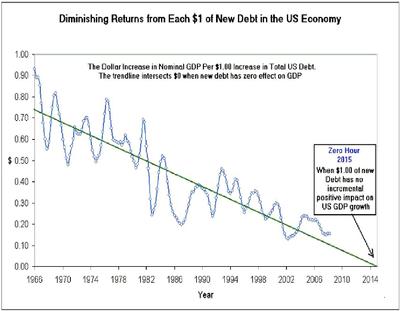
This is a bit of a drive-by post and I’m not going to comment for now on the chart below. I haven’t really absorbed it mentally yet. I don’t know the source of this data either so take it with a grain. But discuss…what does it mean? My god, what does it mean?

Mon 9 Feb 2009
The WaPo posted the following graphic that details Congress’s $819 billion stimulus package.
Wonder if all this stuff is a good idea or not? Read the Mish’s opinionated piece on the topic.
Sun 1 Feb 2009
I thought I’d take a look at the housing data for my area… This is from OFHEO data, so it’s not necessarily realistic, but it should give us a flavor of what has been happening.
House sale prices in Durham are definitely falling, and are actually falling faster than in nearby Raleigh/Cary. This chart looks a little scary, until we include other cities into the mix.
As I’ve done in the past, let’s now compare the Durham market to San Diego and Miami…
I think the home owners in Miami and San Diego would love to have the 1.5% growth that Durham has been experiencing. (FYI, the 1.5% changes is the annualized change.)
While house prices may fluctuate, the value of your house does not. As long as you don’t borrow money based on the price fluctuations (and get caught on the wrong side right now), the changes in prices shouldn’t really mean that much to you.