Thu 12 Feb 2009
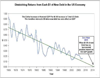
This is a bit of a drive-by post and I’m not going to comment for now on the chart below. I haven’t really absorbed it mentally yet. I don’t know the source of this data either so take it with a grain. But discuss…what does it mean? My god, what does it mean?

February 12th, 2009 at 10:30 pm
This is a well established trend in macroeconomics that I remember discussing and studying as an undergrad. If I remember correctly, it is usually presented as a hockey-stick up chart, where it shows how much new debt is required for each increase in GDP we get as a result.
You can read some deeper analysis from Mauldin back in April 2007. The source he quotes suggests that the decreasing periods are times when consumer debt is overtaking corporate debt. The general idea being that corporate debt generally leads to more productivity/output, whereas consumer debt does not add as much to output.
The charts in that post are a little more detailed than the one you found… and if we include the 1940s, the trend might not be so obvious. Regardless, it would seem that we are approaching an asymptote where we can’t go much further… but that’s not necessarily true, we could conceivably go negative on that chart where more debt decreases GDP.
Interesting times…
February 12th, 2009 at 10:43 pm
Mauldin’s email uses the term “marginal utility of debt”, but googling on that phrase doesn’t turn up much. I’ll see if I can remember the phrase used in my econ classes…
April 2nd, 2009 at 2:53 pm
Just found something that refers to the ratio as “marginal productivity of debt”. That turns up some different hits by google…