Sun 15 Feb 2009
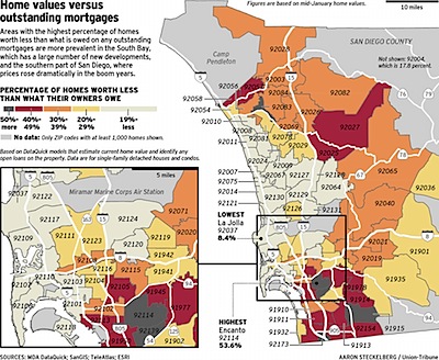
Thought I’d pass this along without comment. This is a map of the San Diego metropolitan area broken out by zip code. The color of each zip is determined by the percentage of homes that are underwater — the home value is lower than the mortgage outstanding.
Found at Kedrosky’s blog.

February 15th, 2009 at 7:38 pm
I rent in 92009 (19% or less). I notice that most of the gray areas are the most sought after areas (oceanfront). The hard hit areas are lower rent areas.