Quant


Eddy Elfenbein recently put forward a simple model relating gold prices and interest rates:

The key insight is that Gibson’s Paradox never went away. It still exists, just in a different form. I got this idea from a 1988 paper by Larry Summers and Robert Barsky, “Gibson’s Paradox and the Gold Standard.”

Where I differ from Summers and Barsky is that I focused on short-term interest rates while they focused on long-term rates. Well, with Operation Twist we got a perfect test of who’s right.

The Fed’s new plan is to sell short-term Treasury bills and buy long-term Treasury bonds. This means that long-rates will be pushed down and short-rates will be pushed up. If gold rises, then Barsky and Summers are right; if gold falls, then I’m right.

At this point Elfenbein is only talking about correlations. But as he continues to discusses his model, he seems to take a causal stance:

I said in my original post that the price of gold is basically a political decision. The Fed can change the game anytime they want to. I can’t say whether this will lead to a long-term decline in gold. That will depend on inflation and interest rates. But for now, the gold market is clearly observing the short end of the yield curve.

I don’t want to presume too much about Elfenbein’s belief about any potential causation. But it’s still an interesting question: is there any evidence of causation? If so, in which direction does it run? (more…)
Most of my thoughts about bottoms recently have focused more on the beach-bathing variety I’m starting to see as spring creeps back to the beach. But since everyone is wondering about the market bottom, I’ll bounce the proverbial quarter off of it and see how high it goes.

I’ve talked before about market “gravity” and price clusters that attract future bids. It’s based on basic auction theory: the price that attracts the most bidding represents the best guess at the value of an item even if people who really want the item badly (or are ill-informed or excited) will pay more (or in reverse auctions, less).

I’ve advanced my work on the idea by taking to the computer and working with the R statistical platform to analyze markets from an auction theory perspective.

So how does the?S&P look in this context? (more…)

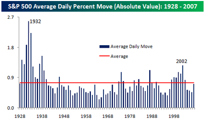
I ran into this interesting post over at the Bespoke website

While most would agree that the stock market has certainly been more volatile this year, putting it in perspective with the long term trend shows that by at least one measure, the S&P 500 was less volatile this year than its long term average.

The chart below summarizes the average absolute daily price change in the S&P 500 by year. In 2007, the average worked out to 72 basis points, which means that, on average, the S&P 500 had a daily move (up or down) of 0.72% versus an average of 0.75% since 1928. While this year was more volatile than the last three years, prior to those years, the last time the market was this ‘placid’ was in 1996.

While this is a very good point and good analysis, I decided to do a little of my own analysis and found… I don’t have as much data as Bespoke does. Going back to 1950 (the furthest back I can go with free and easily available data from Yahoo Finance), the average daily change is 0.62%. That makes sense, considering that I couldn’t include the 1930s when volatility was so high.

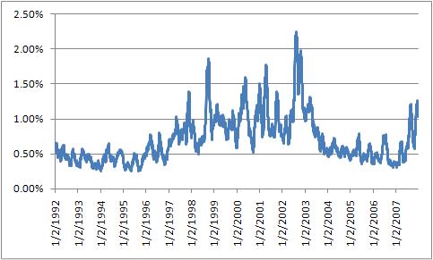
Despite that, I forged on to find a few interesting things… if I look at the 30 day moving average of daily price change, we get a slightly different picture. The average volatility for 2007 has been skewed lower from the low-volatility of the first 6 months of the year. Outside of the last three years, the last time volatility was this high/low was early 2002 when the markets were mid-patriot rally.

volatility_30dma.jpg

Similarly, it is worth looking at volatility on multi-day time frames, such as weekly price change or monthly price change. As we go to longer time frames, the changes look more similar to the first chart that Bespoke published.

Given that the big news is the big market down day (and, as I write, the aftershock), I figured it was the perfect time to try some of the concepts I learned in Why?Stock Markets Crash. Sornette provides a non-linear model formula that he attempts to fit to markets and notes that when this model finds a good fit, it often does so right before major crashes. This concept relates directly to talks of singularities. Basically, exponential growth, peppered with log-periodic (equally spaced on a log chart but closer and closer together on a standard chart)?waves, results in a singularity or critical time where a crash is highly likely.

There are several parameters that need to be optimized and, since it’s non-linear, it requires some major computation power. All those parameters make it more difficult because, during fitting, you happen upon local minima that?aren’t the real best minimum. So you have to run the optimization several times with different starting seed values and hopefully converge on the answer.

So enter Java. I wrote a program that would read in market data (S&P 500 since the ’03 bottom) and try to perform a fit to the model. (more…)

I’ve read plenty of vitrol about the Sharpe Ratio (return divided by volatility) and how dangerous is can be and how insufficient it is as a measure of risk, but I’ve never been one to go all black & white about any piece of information. I find it hard to believe that something valuable can’t be gleaned from what it is saying to an investor, at least on a relative scale. My current experience with UP (Uberman’s Portfolio)?has brought it to my attention just how much of an uphill battle we often create for ourselves when we invest. Part of why UP has done well in recent times is that it’s a rare blend of high yields on reasonable volatility with very dynamic risk control capabilities such as low costs and small incremental lot size. In other words, the Sharpe Ratios in the forex world are historically high. The volatility of the markets, especially when diversified, is not a large multiple of the yields. (more…)

No, not the blog (or rather the blog of other blogs).? I mean specifically the alpha that they are seeking.? What is it? (more…)

Ok, as promised, a primer on density profiles or meta-MarketProfiles or whatever you want to call them.

(more…)

This is by far the tastiest morsel of economic data I’ve ever seen:

Big Mac Index

Now, do you want fries with that?

I promised a quick lesson in the do-it-yourself Monte Carlo analysis so here goes.

First, some supplies:?

MCSim Excel Add-In: Just?drop this in Application Data\Microsoft\AddIns under your Documents and Settings directory.? Then, in Excel, Tools/Add-Ins… to install.

Resample Demo: A demo worksheet to show how to create a random sample from your raw data.

To begin (more…)

Need to calculate the implied volatility of an at-the-money option on the fly and you left your Nobel laureates at home?? Not a problem…

IV = 40 x p / SQRT(t)

where p is the price of the option (as a % of the underlying) and t is trading days until expiration.

That’s all.? Forget all the complications of the million dollar formula as this gives you all you need.? However, it only works at-the-money, but then again so does Black-Scholes.

So what if the price is between strikes so there is no at-the-money?? Well here is another spiffy formula:

CM = 1.04 – 0.04 * R

where R is the ratio of the more expensive to least expensive options that are nearest to the money.? Just multiply your option price p above by CM and there you have it: the price converted to the at-the-money equivalent.

?

Subscribe to Tasgall

Categories

Archives