I was just looking over some charts, and figured I would upload a few here to share my thoughts.

As far as the SPX is concerned, I think it has decisively breached support. Whether it turns out to be a false breakout or not depends more on time than on distance (in my opinion). With the time frames being so long (97 to 02 to 09), I wouldn’t call it one way or the other for another 6 months or so…

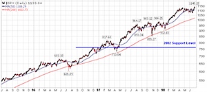
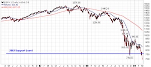
Here is the most recent 3 years of the S&P 500 (SPX) Index:

Picture 3.png
link

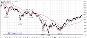
That line on the chart marked 2002 support level is approximately the lows back in 2002. Many would argue (and justifiably so)that support lines are a range of support, so take the hard, thin line with a grain of salt.

Picture 2.png
link

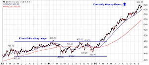
And here is the same line going back to 1997 timeframe…

Picture 4.png
link

If the current breakdown isn’t a false breakout, then the 1996 trading range would come into play as the next support zone.

Picture 6.png
link

I’m not basing any of my trading off of these support zones, though many other people do, thus creating a self-fulfilling prophecy. To me, the real value is knowing where other people are focusing, and adapting to the situation as it unfolds.

As they say, technical analysis is in the eye of the beholder.

Coincidentally, you can see the same relative approximate support zones in the Dow (current, 2002, 1996, 1996 closeup).

Amazingly enough, the Nasdaq (NDX or COMPQ) hasn’t broken below the November 2008 lows yet. One potential cause for this — it had already fallen 54% from its 2007 peak (NDX specifically), while the SPX is now at the same 55% decline. Basically both the NDX and SPX are at the same position relative to their highs, the NDX just dropped further (was an outperformer to the downside) during last year’s market lows.

Another cause is the fact that the NDX specifically excludes financial companies, and this sector is obviously not contributing well to overall market strength.
I’m not sure where they got the “death” part from, but this is a pretty poster for the finance geeks out there… how is our federal budget spent?

200902180008.jpg

Closeup:

Picture 1.png

The poster retails for $24.

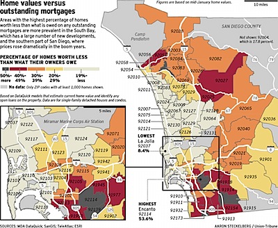
Thought I’d pass this along without comment. This is a map of the San Diego metropolitan area broken out by zip code. The color of each zip is determined by the percentage of homes that are underwater — the home value is lower than the mortgage outstanding.

sandiego-underwater-tm.jpg

Found at Kedrosky’s blog.

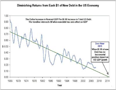
This is a bit of a drive-by post and I’m not going to comment for now on the chart below. I haven’t really absorbed it mentally yet. I don’t know the source of this data either so take it with a grain. But discuss…what does it mean? My god, what does it mean?

debt-contributionserendipitythumb2

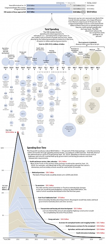
The WaPo posted the following graphic that details Congress’s $819 billion stimulus package.

stimulus-sm.jpg

Wonder if all this stuff is a good idea or not? Read the Mish’s opinionated piece on the topic.

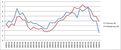
I thought I’d take a look at the housing data for my area… This is from OFHEO data, so it’s not necessarily realistic, but it should give us a flavor of what has been happening.

200902010934.jpg

House sale prices in Durham are definitely falling, and are actually falling faster than in nearby Raleigh/Cary. This chart looks a little scary, until we include other cities into the mix.

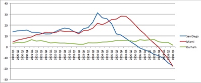
As I’ve done in the past, let’s now compare the Durham market to San Diego and Miami…

200902010944.jpg

I think the home owners in Miami and San Diego would love to have the 1.5% growth that Durham has been experiencing. (FYI, the 1.5% changes is the annualized change.)

While house prices may fluctuate, the value of your house does not. As long as you don’t borrow money based on the price fluctuations (and get caught on the wrong side right now), the changes in prices shouldn’t really mean that much to you.

There’s an old saying, “In the land of the blind, the one-eyed man is king.”

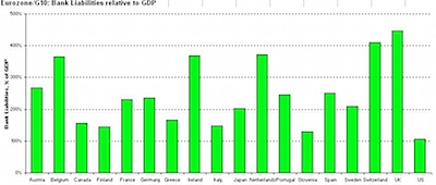
In global economies, the US situation looks horrible, until you compare it to everyone else. Below is the chart of bank liabilities relative to GDP.

In this case, we might say that in a world full of bankrupt economies, the slightly-insolvent economy is king.

200901311349.jpg

Source.

Apparently the CNBC Trading Contest is now over… Oddly enough, with my strategy of doing very little, I didn’t even notice that the contest finished up.

I’m quite impressed by my performance this year. My best portfolio ranked 5,673rd place at the end of the contest which put me in the top 1.1% of contestants with a cumulative gain of 73.6% since November 17 when the contest started (9 weeks).

Wow. If only I could boast about that type of return in my real trading accounts…

Here are the results broken out by portfolio:

  • Shiny (gold stocks) : +73.6%
  • Important (giants) : -8.4%
  • Dividend : -11.8%
  • Growth : +15.7%
  • ou812 : +5.3%

Incidentally, over the same time period the S&P 500 returned -2.2%.

Obviously, my Shiny portfolio benefited from the sector the holdings were in (Gold Stocks) more than anything, and gold stocks returned around 69% over the same period.

If only the other 5672 people who finished in front of me would be disqualified so I could compete in the final trading round…

There’s another good quarterly letter from GMO’s Jeremy Grantham. Here’s a choice quote about the illusions of wealth that our society just experienced.

During the market?s rise, I wrote about the fallacy of paper wealth, particularly as it applied to houses. At three times the price, they were obviously still the very same houses. How could we kid ourselves that we were suddenly rich and didn?t need to save for our pensions when we were sitting in the very same buildings we bought in 1974? With ?wealth? built on such false premises, it is not surprising that we come to grief from time to time. But the good news is that, as we move back down to earlier prices, they are still the same houses. We have not lost wealth, but just the illusion of wealth. Illusions tend not to have very long-lasting effects, but they obviously can and do have very powerful short- and even intermediate- term effects. This particular illusion, which applied to stocks, real estate, art, and almost everything else, was grand indeed, and it directly over-stimulated consumption and indirectly over-stimulated imports. In the process, it suppressed both savings and investments of our own locally generated income.

…it is worth remembering that real wealth lies not in debt but in educated people, laws, and work ethic, as well as in the quality and quantity of ?xed assets and the effectiveness of corporate organization.

He also argues that, as a ratio of debt-to-assets, we need to lower the total debt in the US economy by $10 to $15 trillion dollars. Some will happy by write-downs (about $1 trillion so far), some by allowing time to decrease the debt, and some by inflating away the value of the dollar.

I’m sure you’ve heard about the new nominee for Treasury Secretary, Timothy Geithner and his apparent IRS oversights… here are a few choice quotes from a WSJ op-ed:

Did Geithner have an incompetent accountant? Maybe. A Senate Finance Committee statement reports that he prepared his own returns for 2000, 2001, 2002 and 2005.

We’re tempted to say America needs a Treasury secretary who is smart enough to figure out his own taxes. But such a cheap shot would be beneath us. Instead, we are going to make a serious point: America needs a tax code simple enough for the Treasury secretary to figure out.

Then there’s this explanation of how the taxes got paid (or not):

The IRS audited Geithner in 2006 and discovered the problem for his 2003 and 2004 returns. Geithner paid just under $17,000 at the time, and the IRS waived any possible penalties.

So far, so good. But then there’s this: “A three-year statute of limitations had precluded the agency from auditing the 2001 and 2002 tax returns, a committee aide said.”

So, what can we learn from Geithner’s little tax trouble?

The guy is not as good at finances as he should be. But then again, apparently we don’t really care about our Treasury Department keeping the books straight, so maybe this isn’t such a big deal.

The other thing worth learning — the IRS is serious about it’s 3 year statute of limitations on audits. So, you really can shred all those old tax returns and forget about it… at least until you are nominated to a top-ranking position in the federal government.

~~

Note: The IRS actually has an exception to the 3 year rule for a “false or fraudulent” return. Unlike other tax law, the IRS actually has the burden of proving fraud before the fraud exception can be applied.

« Previous PageNext Page »